Implementation of interactive data visualizations
Our programming skills in the field of data visualisation with D3.js and other visualisation tools are also available to organisations from the public and private sector. Below you find some examples and references from our activities in field of data visualization.
Platform "Sustainable Real Estate Management" for Real Estate City of Bern
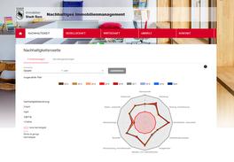
On behalf of the Sustainable Real Estate Management of "Immobilien Stadt Bern", the research centre has programmed a platform for visualising the data of the previous sustainability assessment. Based on this data, all buildings can be assessed in the three sustainability dimensions of society, economy and environment. The platform replaces the previous printed annual reports.
Poor countryside, rich cities? Visualization on the social structure of poverty
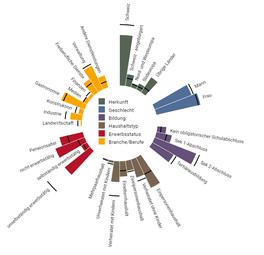
Researchers at Bern University of Applied Sciences BFH have investigated the spatial dimensions of poverty in a project funded by the Swiss National Science Foundation, revealing differences between urban and rural areas. Effective poverty reduction policies should incorporate these differences in the design and delivery of their services. The research centre was commissioned to visualize the results.
When enough is enough, I decide - visualisation on euthanasia
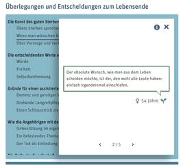
A project funded by the Swiss National Science Foundation investigated the decision-making and freedom of choice of people who consider assisted suicide as an end-of-life option. In doing so, it also exposed the tensions that a pluralistic society must endure in dealing with death. By means of an interactive data visualisation created by the research centre, the results of the study become more comprehensible.
Poverty monitoring - the instrument against poverty
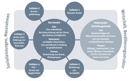
Globalisation, digitalisation and crises are changing the risks of poverty. This is why policymakers need a solid factual basis for poverty reduction. Together with Caritas Switzerland, the Bern University of Applied Sciences (BFH) has developed a model that can significantly improve poverty monitoring in the country. An interactive infographics developed by the research centre shows how the model can be used to make better use of the available data.
Visualisation for self-determined living
In federalist Switzerland, various ways are being tried out to promote the self-determination of people with disabilities in the area of housing. Accordingly, the regions have developed differently over the last ten years. However, the trend clearly points in the direction of private housing. For the blog "Knots and Meshes" of the Centre for Social Security of the BFH, the research centre visualised data from a study on self-determined housing for people with disabilities.
Financial Data of the Canton of Berne
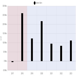
On behalf of the Finance Directorate of the Canton of Berne, the Digital Sustainability Research Centre has implemented a new database (MariaDB) on which data from 1086 Excel files were visualised using Chart.js. It replaces the previous platform on which this information was available in Excel tables. In future, the data will be expanded three times a year (after completion and planning of the annual accounts in mid-May, end of August and end of January) Information on various accounts of the authorities and directorates can now be found on fin.be.ch
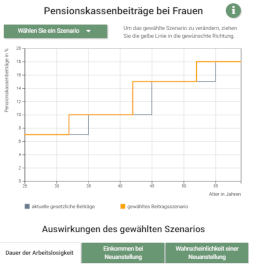
Labor Market 45+

As part of the "Labour Market 45+" project, the Berne University of Applied Sciences calculated the effects of age-graded pension fund contributions on wages and unemployment. It did this on the basis of the 2005 BVG revision and the reduction in contributions for women contained therein. The Research Center for Digital Sustainability has created an interactive visualization for this purpose:
Politmonitor Basel-Stadt
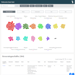
The Politmonitor is based on data from the presidential department of Basel-Stadt and was developed by the Research Center for Digital Sustainability as part of the OGD pilot project of the State Chancellery of Basel-Stadt. The app shows petitions, postulattes and motions transferred by the legislative to the executive of the Canton of Basel-Stadt by majority vote as well as cantonal popular initiatives.
Speed measurement of the canton of Basel-Stadt
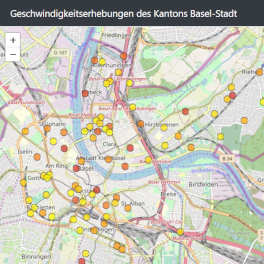
The visualization of the speed measurement is based on data from the Basel-Stadt cantonal police, which were collected for statistical purposes. The data were visualized in the context of an Open Government Data pilot project by the Research Center for Digital Sustainability of the University of Bern. The data are continuously updated by the Basel-Stadt cantonal police.
Labor Market 45+
As part of the "Labour Market 45+" project, the Berne University of Applied Sciences calculated the effects of age-graded pension fund contributions on wages and unemployment. It did this on the basis of the 2005 BVG revision and the reduction in contributions for women contained therein. The Research Center for Digital Sustainability has created an interactive visualization for this purpose:
Barometer Good Work
Since 2015, the BFH Social Security Center and Travail.Suisse has been using the "Good Work Barometer" to measure the quality of working conditions in Switzerland. The Research Center for Digital Sustainability has visualized the results for the third time. In 2018 time series will be presented for the first time:
Platform Foundation Statistics
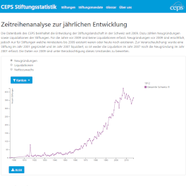
With www.stiftungsstatistik.ch, the Center for Philanthropy Studies (CEPS) of the University of Basel provides a new platform for foundations. The platform provides flexible and direct access to information on foundations in Switzerland. The platform was developed by the Research Center for Digital Sustainability.
Open Data Showroom
The Open Data Show Room was developed by the Research Center for Digital Sustainability and contains the interactive data visualizations that students developed during the Open Data Lecture. This lecture of the University of Bern takes place in the spring semester and has produced a variety of great Open Data visualizations since 2014.
Open Source Study 2018

On behalf of swissICT and CH Open, the Research Center for Digital Sustainability has been responsible for the Open Source Study Switzerland since 2015. In addition to the online survey on areas of application, reasons and obstacles when using open source software, the study contains 26 contributions from open source practitioners. Besides the publication as a brochure and as a PDF file, the Research Center for Digital Sustainability has also created a website with interactive visualizations:
Disease and poverty risks by social origin
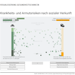
For the Social Security Center at the Bern University of Applied Sciences, the Research Center for Digital Sustainability has visualized the risks of disease and poverty according to social origin:
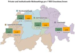
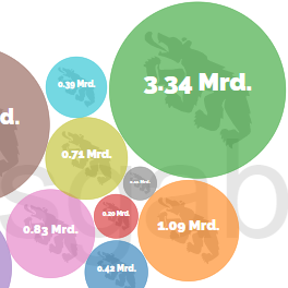
Switzerland's wealthy mountains and valleys
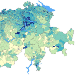
For the Social Security Center at the Bern University of Applied Sciences, the Research Center for Digital Sustainability has visualized Switzerland's mountains and valleys of prosperity:
Switzerland's wealthy mountains and valleys
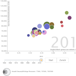
For the Social Security Center at the Bern University of Applied Sciences, the Research Center for Digital Sustainability has visualized Switzerland's mountains and valleys of prosperity:
Employment integration of the unemployed
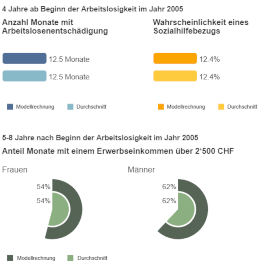
For the Social Security Center at the Bern University of Applied Sciences, the Research Center for Digital Sustainability has visualized the integration of unemployed people into the labor market:
Non-subscription rate in cities and municipalities
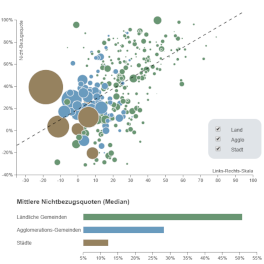
For the Social Security Center of the Berne University of Applied Sciences, the Research Center for Digital Sustainability has visualized the non-payment rate for social assistance in towns and municipalities on the left/right scale according to their political situation:
"Schritt auf Tritt"
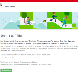
The "Schritt auf Tritt" health promotion programme of the cantonal administration in Berne is designed to bring more movement into the working day of cantonal staff - without investing too much time and sweat. The Research Center for Digital Sustainability is responsible for the technical implementation:
Linked Data Show Case: Energy saving potential for train heating systems
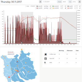
On behalf of the Swiss Federal Archives, the Research Center for Digital Sustainability has visualized several LINDAS (Linked Data Service) Show Cases. Data from MeteoSwiss and SBB were "linked" for a show case. This enabled the user to see how much energy could be saved by heating the SBB scales if the MeteoSwiss weather data were used.
Linked Data Show Case: Spread of animal diseases
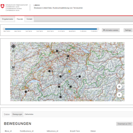
On behalf of the Swiss Federal Archives, the Research Center for Digital Sustainability has visualized several LINDAS (Linked Data Service) Show Cases. The animal traffic data of the Federal Office for Food Safety and Veterinary Affairs (BLV) regarding the spread of animal diseases were visualized for a show case.
Visualization of the finances of the Canton of Berne
On behalf of the Finance Directorate of the Canton of Berne, the Research Center for Digital Sustainability has visualized the finances of the Canton of Berne:
Visualization Pollutant Register
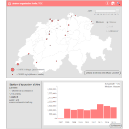
On behalf of the Federal Office for the Environment, the Research Center for Digital Sustainability has developed an interactive visualization of the publicly accessible Swiss Pollutant Release and Transfer Register (SwissPRTR). SwissPRTR provides information on the release of pollutants into air, water and soil as well as transfers of waste and pollutants in wastewater.
Data Visualization Group
During the webmap workshop the idea came up to found a Bernese D3.js user group. The aim is to meet regularly, to promote exchange, to impart knowledge about D3.js to each other and to expand the network. Informal conversations are held and short presentations are given: